As you may know, we created a new logo for Key using a circle and rotational animation  to create a visual representation of pi. Karen Coe describes this in her post Branding Isn’t About Math. Are You Sure About That? (You can also build this logo yourself, and explore its connections to pi, using this Web Sketchpad model.)
In the article, Karen talks about how using math and our own software, Sketchpad, to create our new logo was a great way to walk the talk – we sell math software, promote and support quality math education, so our logo is math. It’s always a great thing when math can be used in a relevant, real-world context.
So I was excited when a colleague forwarded a story about Twitter’s logo design update that talked about how three sets of three interlocking circles were used to create the new, streamlined Twitter bird. Another example of a logo created using math. (Be sure to watch their quick video clip of it.)
Naturally, I had to play around on Sketchpad to see if I could recreate the Twitter bird.
I haven’t quite figured it out yet, but that is part of the fun, isn’t it? The challenge of trying to determine what went on behind the scenes. How does this work? What size circles did they use? What parts were colored from the intersections? For those of you out there, give it a try yourself or let your students try—it requires a bit of understanding of arcs, arc sectors, intersecting circles, and so on.
Of course, all of this led me on a math-logo treasure hunt. What other logos have mathematical constructs behind them? Obviously we could say many, as most logos are geometric in nature. But it’s not always obvious what the underlying math construct is, so wouldn’t it be interesting to try and figure it out, using a dynamic tool like Sketchpad to try to recreate some logos and discover the mathematical constructs and relationships? Perhaps a fun summer project for students, or a potential project to explore for next year.
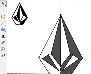
 I found this great website, Famous Logos, where you can click on a logo of interest and it tells you about how the logo was developed, what it represents, and its design elements. So, for example, the Volcom logo looks like an inverted diamond, but it’s really a polygon with various triangles reflected over a line (see my Sketchpad version to the left). My treasure hunt was purely geometric in interest—what could I try to recreate with Sketchpad? Therefore, most logos with words in them I wasn’t interested in. Here are few that are interesting in relation to this treasure hunt. How would you reconstruct them? What’s the mathematics behind them?
- The Girl Scout Logo which includes translations of images
- The Toyota Logo which involves intersecting ellipses
- The Steelers Logo which contains three ‘asteroids’ (I thought they could be created using line designs on a coordinate axis) within a circle
- The Batman Logo which definitely involves reflection
- Chevrolet Logo where we have possibly parallelograms, rectangles and reflection or translation? Probably a couple ways to recreate this logo.
- Mitsubishi Logo which involves the rotation of a rhombus
Explore for yourself and let your students explore as well. Great creativity lessons and a nice answer to the ever-present question, “When are we ever going to use this?” Clearly—math and logos go together!
Another math-created logo is the Nike swoosh, which is a Bezier curve based on the relation of rectanglular perimeter to width.
Thanks Shawn! That logo is on the FamousLogos site as well, so hopefully folks will explore it. I appreciate you identifying the name of the curve – did not know that!!
This is a nice project to give students; I think many students don’t see math as an artistic tool. Many of these logos (and the Twitter one in particular) make use of lunes. (A lune is the region between two intersecting circular arcs; its name is derived from the Latin word for moon, because it looks like a crescent moon.) Because lunes are not built into Sketchpad, these regions have to be constructed. I’ve just posted on Sketch Exchange a sketch that sets out the construction challenge (with some hints) on page 1, shows the completed construction on page 2, and shows a part of the Twitter logo construction on page 3. You can find it here on Sketch Exchange:
http://sketchexchange.keypress.com/sketch/view/510/constructing-a-lune
Wow – thanks for the lune information and also the cool Sketch. I am excited to start playing with it!!