Pass the Candy! Sweetening the Study of Probability
As part of our guest blog series, we bring you another post from Kathryn Shafer. A former middle school and high school math teacher, Kathy is now an  Assistant Professor in the Department of Mathematical Sciences at Ball State University, Indiana. She’s done a variety of work for Key, including presenting webinars, moderating online courses, and delivering face-to-face professional development workshops.
Many mathematics educators are fluent in how to deal with uniform sample spaces: fair coin flips, rolling a fair die, or drawing a marble out of a bag that contains one of each color. Experiments can be simulated to find an experimental probability. Tree diagrams can be sketched to find the theoretical probability. But how are these related? More specifically, what changes if the sample space is “lopsided” (nonuniform) instead of “balanced” (uniform)?
This summer, I was challenged to make a connection among three concepts: random sampling, uniform sample spaces versus nonuniform sample spaces, and how statistics can be used to answer probability questions. Making connections between concepts and representations is what dynamic software is all about. So I took advantage of the sampler engine in TinkerPlots Version 2 to create an activity in a graduate level course for inservice teachers.
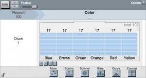
To prepare the activity Candy Co, I designed two different sampler engines in TinkerPlots to represent two types of candy. Both candies have the same five colors and I entered the proportions of each color (as determined by the company) into a stacks device. The activity has two goals. The first is to determine which sampler has balanced candy color proportions, Family Fudge or Candy Co. The second goal is to find the hidden color proportions in the “lopsided” sampler.
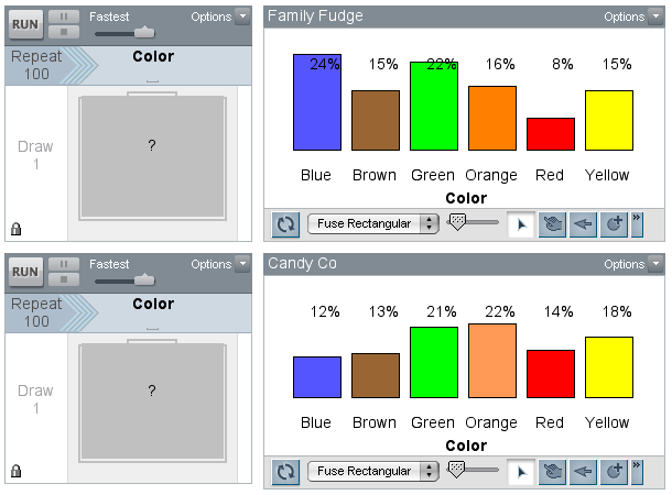
To launch the activity, I ran the sampler with a repeat value of 100 candies. I graphed the color attributes from the results case tables (not shown) in bar charts, and I modified the default attribute colors to match the attribute labels. By showing the percentages in each plot, we could make comparisons.
Before reading further, make a guess as to which candy company has a balanced proportion of each candy color and which company has a lopsided amount for one or more of the colors.
The inservice teachers were surprised to see that neither of the plots looked very balanced and making a decision was harder than they had anticipated. We discussed random sampling, and a teacher suggested that we increase the number of trials. By increasing the number of trials, we were applying the Law of Large Numbers. The teachers instinctively knew that if they continued to randomly draw out candy, the percentages for the colors would not fluctuate as much; they would “settle down” or be more consistent. The next figure shows the results after we increased the sample size to 500 candies.
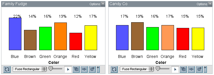
The teachers accurately identified that Candy Co’s factory settings required balanced candy colors (a uniform distribution). Since there are six colors, each candy color has a theoretical probability of 16.6%.
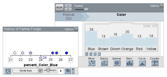
The next challenge was to find the hidden color proportions in Family Fudge’s sampler engine. One of the teachers suggested that we take five samples of 500 candies and average these values. The history tool in TinkerPlots makes it easy to complete this action––when the plot’s history tool is selected, the user is able to select any the percentages shown in the plot (look for the grey box around each statistic).
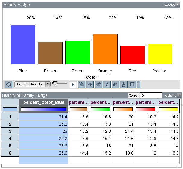 As you can see in the history table, it looks like the percentage for the blue candies is right around 24%. The dot plot below shows that the mean of the five proportions (from these samples of 500 candies) for the blue candies is 24% (I did not rig this!). An advantage of the history table is that you can keep track of the results of random sampling which would typically be lost as each iteration of the sampler replaces the last set of results. Note that while the average proportion of blue candies is 24%, the range for the five samples went from 21.4% to 26.6%.
 So here you have it, an activity that makes connections between uniform and nonuniform distributions, situated within a context that we are all quite familiar with—M&M’s. Please pass the candy!