Introducing Dynagraphs
Students often have difficulty connecting the Cartesian graph of a function to the actual motion of the variables. Their challenge in visualizing and describing covariation (the way y varies as x varies steadily) relates to their understanding of function families: function families are distinguished by the nature of their covariation. A function whose growth rate remains constant is a linear function, a function whose growth rate steadily increases or decreases is a quadratic function, and a function whose relative rate of change is proportional to the value of y is an exponential function.
The predominant visual representation of functions that students encounter is the Cartesian graph. As powerful as this representation is, it is a static image in which the independent and dependent variables are usually implied rather than shown. Not surprisingly, students tend to focus on the shape of the graph rather than the motion of the variables, without attending to the way in which that shape is a consequence of the relative motion of the variables.
To promote students’ ability to visualize a function as a rule that connects two moving variables, we introduce below a representation known as a dynagraph. A dynagraph has two horizontal axes with the independent variable on the top axis and the dependent variable on the bottom axis. The parallel axes make it easy for students to compare the relative motion of the two variables. (The term dynagraph was coined by Paul Goldenberg, Philip Lewis, and James O’Keefe in their study “Dynamic Representation and the Development of a Process Understanding of Functions.”)
Matching Functions to Their Dynagraphs
The Web Sketchpad model below (and here) displays a collection of dynagraphs across two pages (Navigate between pages using the page controls in the lower-right corner.) For each dynagraph, students should either drag the input marker (a, b, c, and d on the first page) or press the Animate button. As students vary the independent variable, ask them to pay attention to the behavior of the dependent variable. Notice that there are no numbers provided, so students must stay focused on the visual behavior of the functions. Encourage students to describe the behavior in terms of position, movement, and symmetry. One of the eight functions has an asymptote—how is that represented in the behavior of the dynagraph? Another function, h on page 1, exhibits rather amusing behavior when input c is dragged. What function might this be? And which dynagraph represents a trig function? To see the actual functions represented by the dynagraphs, press Show Functions.
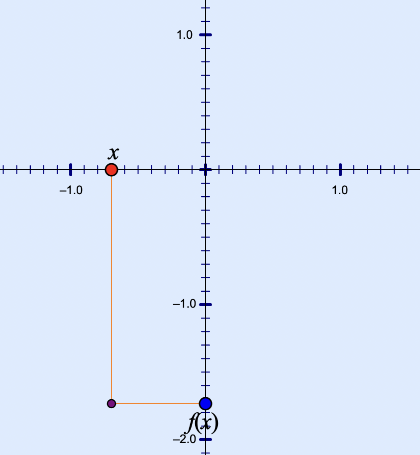
In the next model below (and here), you and your students get to choose your own function and view it in dynagraph form. Just double-tap f(x) and enter a new function. You can decide whether to hide the function as well as the numbers and tick marks on the number line or keep them visible. To animate the dynagraph, press Vary x. On page 2 of the websketch, the segment connecting x and f(x) is traced when the dynagraph is set in motion.
The Dynagraph-Cartesian Connection
In the final dynagraph model below (tap the image to load to it), students move between a dynagraph and its Cartesian counterpart. The websketch shows a dynagraph of a function, f(x). As before, you can change the function by double-tapping it. Press Vary x to set the dynagraph in motion, and press Show Connector to view a line connecting x to f(x). Then, press the Cartesian button and watch as the dyngraph transforms itself, with the parallel axes becoming perpendicular and the connector bending to form a right angle.
Voilà! Your dynagraph has morphed into the familiar Cartesian representation. Stop the motion of x and f(x) and use the Trace widget to trace the point at (x, f(x)). Now press Vary x again to view the path of the point.
A short video demonstrating all of the dynagraphs featured in this post is available here.
Note: Our other dynagraph-themed posts are Dynagraphs of Linear Functions and A Triple Number Line Model for Visualizing Solutions to Equations.