My partner and I spend a fair amount of time talking about data visualization. He’s a computer programmer who works on websites that gather and display large amounts of data related to energy production and consumption. This data can be used to answer questions like: “How effective is the California Solar Initiative?” and “Where in California is solar power generation most efficient?” The answers: “Quite”; and “Not where it’s hottest!” Solar panels are most efficient at about 70°F, so they actually do better in moderately warm temperatures, not in the hot central valley or inland San Diego or Los Angeles counties. Processing live and vast amounts of data enables discoveries like that, which can lead to beneficial innovations and policies.

He also has it as an ongoing project to explore novel data display mechanisms, which led him to this website that he shared with me—it’s examples, tools, and code for web developers to use to display data. One of the things I love about this site is that it shows possibilities for conveying data that are not possible on paper. The ability to hover and click opens up many possibilities for conveying more information.
Here’s a simple example:
Link to the live version here. Notice anything missing in this display? There’s no key! But you can see data for every county by hovering. You can change the color scheme too, if you’re so inclined.
This is an interesting one too. Click the buttons labeled “Group” and “Stack” for a slick animated transition between two ways of viewing a set of numerical data.
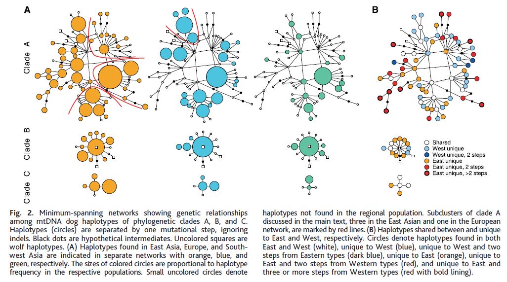
As I poked around the examples in this gallery when it was first shown to me a month or so ago, I thought some of these plots really went overboard, and actually obscured meaning by trying to show too much in too flashy a way. Our good old graphs are already capable of showing so much, thought my old math teacher self. But in the intervening month, I’ve come across two totally new kinds of graphs to me. One is this one, which shows evidence based on mitochondrial DNA samples that domestic dogs are originated from East Asia.

This graph took me a while to interpret, and I admit I still don’t fully understand it. But it opened my eyes to the fact that, actually, there are types of graphs that are needed in the world that I’ve never been exposed to. Different fields have needs to express all kinds of complex data, and not all of it can be crammed into pie graphs or representations with 2 or even 3 axes.
It also made me realize that just because I have a pretty mathy mind and a lot of experience with data and statistics, doesn’t mean I can just easily figure out every graph I might come across. Which brought me to thinking about TinkerPlots Dynamic Data Exploration software. There’s so much power in students being able to endlessly tinker to create their own plots, and think about what each one conveys, and what questions are not answered by that plot. How can that experience not benefit students when they come across data display types that they’ve never seen before?
