Last week, Scott and I attended a fraction symposium at NYU, and it made me realize how long it’s been since I’ve written about our Sketchpad work with fractions. Below is a Web Sketchpad model for displaying and solving fraction multiplication problems. Representing fraction multiplication with an area model is a common approach, but it’s challenging to sort out the exact role that technology should play in the modeling process. Scott and I e-mailed back and forth with at least six different approaches, and every time I thought we had found the ideal interactive representation, a better method still beckoned.
What design challenges did we face?
For starters, we knew that the technology should eliminate any accuracy issues that students face with paper and pencil. While it’s far from easy to divide a sheet of paper into fifths or sevenths, Web Sketchpad can make this process simple and precise. Nonetheless, we didn’t want the software to automate the process entirely—students should still choose the number of vertical and horizontal divisions in their square. And given a problem like 1/2 x 1/3, students should be free to divide their square vertically in halves and horizontally in thirds or vertically in thirds and horizontally in halves.
We also wanted students to decide whether to think of 1/2 x 1/3 as 1/2 of 1/3 (in which case they would shade one third of the square and then shade half of that third) or to regard it as 1/3 of 1/2 (in which case they would shade one half of the square and then shade one third of that half). In retrospect, these sound like straightforward design principles, but when you’re building a model, it’s extremely easy to limit the choices available to students, perhaps unintentionally, because the programming involved is much simpler!
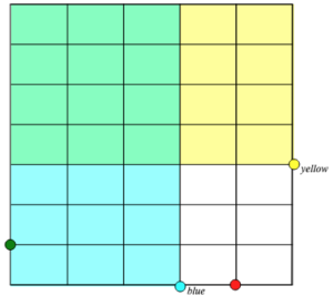
I don’t claim that Scott and I achieved the perfect interactive model, but after many scrapped attempts, I’m ready to say that we gave it a good shot. See what you think below (and here) and let us know. To assist you in understanding the model, here’s an image showing the result of dragging the yellow point and the blue point to represent the product of 4/7 and 3/5:
An annotated list of all our elementary-themed blog posts is here.

I think this is a very powerful model and the decisions you made are very interesting. Using a slider to determine the next to last partition of a length is particularly intriguing. I also like that you decided to have the user create the rectangles rather than having them constructed for them. I enjoyed “cheating” the sketch by creating an overlapping area that didn’t match the expected solution but did have the correct area.
The timer on the feedback also gave me pause.
I’m glad you liked the model, Ross. It’s true—you can “cheat” by creating areas that are correct but not the intended ones—an interesting consequence of the way the model is built.
Hi Daniel
I wonder if the app can be adjusted to consider also fractions larger than 1. That will be awesome!! I would love to be able to show with this that 3/2 x 2/3 = 1 !!
Thnx 🙂